When I was studying for the engineering board exam, I worked for a bit as a Lifeserver at van Gogh is Bipolar (vGiB), a quaint restaurant in Maginhawa that serves mood-healing meals. As a Lifeserver, I made sure that the diners were comfortable and had what they needed. But more than that, I also lent an ear to those who needed someone to talk to. vGiB promotes healing not only through food, but also through meaningful conversations.
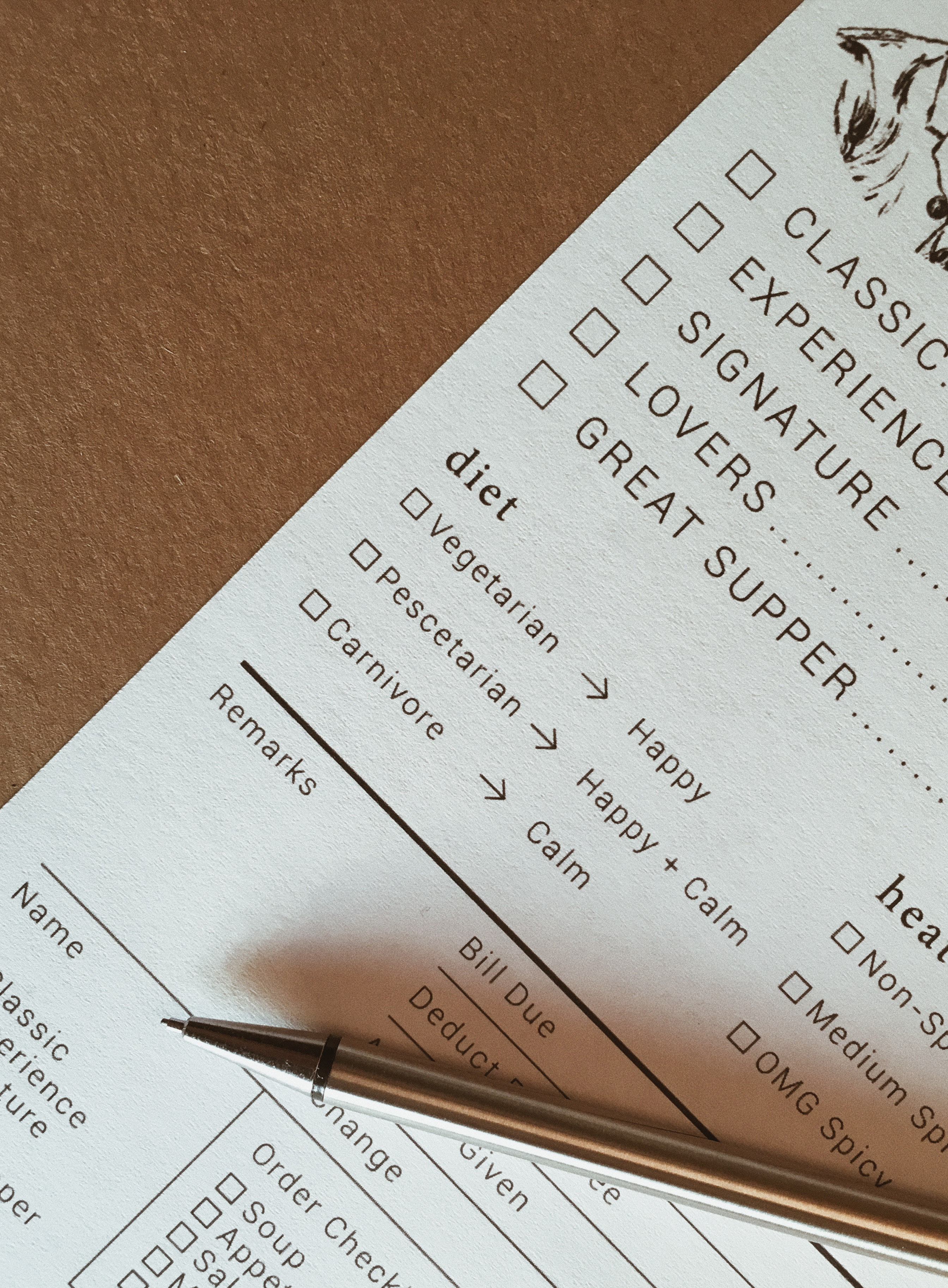
During my shift, I noticed that the guests were having trouble reading and filling out the order form. The font size was too small, the arrangement of the elements was confusing, and there wasn't enough space for everything to be easily readable.
Design considerations:
- Refrained from using gray elements because the order slips were reproduced through photocopying.
- Divided a letter-size paper into 3 sections instead of 4, allowing sufficient space to include all essential visitor information without compromising legibility.
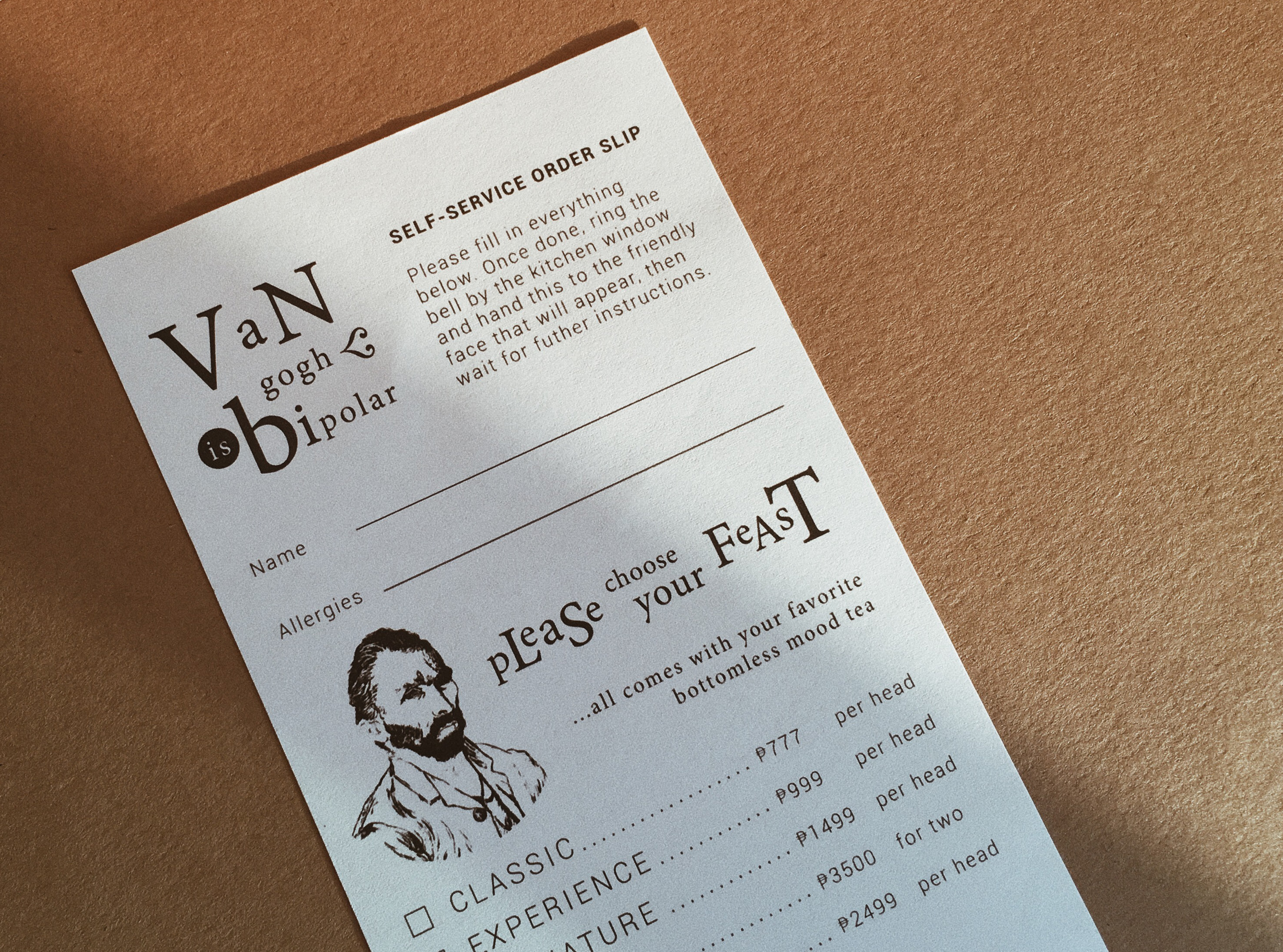
- To reflect the restaurant's quirky personality, added a whimsical touch by using mixed capitalization for the "Please Choose Your Feast" section title and featuring an illustration of Vincent van Gogh, the restaurant's patron saint.